18
Jun

SickSky Launcher for Android

SickSky settings panel

SickSky Launcher (Google Play Store link) is a very simple Android launcher/home screen, with no widget support. If you love your widgets, this launcher is not for you. But if you just want access to your apps, calendar, and weather, you might want to check this out.

When launched, the homescreen is divided into three panels. The top panel shows the current temperature for your location, and the date and time. The middle panel is mostly empty unless you do some actions. The bottom panel has two buttons.

But where are your apps? Click on the button on the right of the bottom panel, and you get to see all your apps at the middle panel. You swipe to the left or right to access apps in another page (16 icons are shown per page).

SickSky apps panel

To show more information about the weather, just click on the temperature at the top panel, and more information is shown in the middle panel. But I have found one quirk with this panel. See screenshot below.

SickSky weather panel

As you can see, the locations shown in the top panel and middle panel are different. Anyway, you are shown temperatures, 5-day forecast, and current condition.

To access your calendar entries, you need to access the settings by clicking the button at the left of the bottom panel (see topmost screenshot).

There isn’t much customization options. This is a simple, minimalistic, no-frills launcher that works fine if you are not fond of customizing your home screen. I like this launcher, but I do like having a panel showing my frequently used apps – it can be tedious swiping around if you have tons of apps installed.

Power users will not be fond of this launcher, but for those who like their home screens simple, this app is worth their time.

20
May

SPlay Launcher for Android

splayfull

I have this app installed yesterday a week ago, and on its second day 2nd week, here’s what I think about this Android launcher.

The launcher (currently in beta but available at the Google Play Store) is basically a group of tappable texts. When you tap and hold on a text, another set of tappable texts are shown, and while still holding the text, you slide your finger to the text that you want, and the corresponding action to that text is launched. For example, to create a new text message, you tap and hold Diary, then slide up to New message.

There are four main text groups, and Apps is the customizable group. You can add up to 7 shortcuts to your favorite/most-used apps by tapping and holding Apps then sliding to Edit Shortcuts. You can also access Google Play in the Apps group. To show all the apps installed, you slide to Apps (you can also show all apps by tapping the context menu (at the top right).

As I am right-handed, the placement of the texts works for me. It should probably work for sinistrals, but I think there should be a setting so that the user can select where the ring is oriented.

The animated ring stops after a few seconds, maybe to preserve battery life, but I feel that it defeats the purpose of the animation. It should rotate infinitely. I am sure most Android users will have set up a screen timeout anyway.

If you are a creature of habit and only uses a set number of apps, this launcher is good. But for those who uses a lot of apps, the limited number of shortcuts is limiting, so this launcher may not be for you. Is the user experience enhanced? Some may doubt it.

Normally, when I test an Android launcher, I usually revert to Go Launcher after a few days. I am on my second week with Splay Launcher, and so far I have no urge to go back to Go Launcher (not a fan of the stock Android launcher). It offers a different experience unlike those other launchers that look like they’re no different from each other. We’ll see if this holds.

15
Apr

Expense Manager for Android

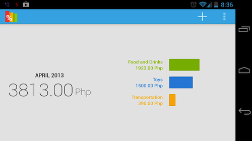
Yes, I know it’s too much expenses for less than 15 days. That’s why I installed this app in the first place, to monitor my expenses and cut down if needed.

This simple app for Android lets you monitor your expenses. Whenever I purchase something, I open the app and add this latest expense (you can instead add a home screen widget so that you don’t have to open the app when recording an expense).

When you open Expense Manager, it shows you a graph of expenses grouped according to categories. There are predefined categories but you can create your own and assign a color for your category. In my case, I added the category Toys, since it’s inevitable that I’d buy at least one a month. (Yeah, I know, don’t tell me.)

You can even view a history of your purchases for a month, and you can show entries for a category. There are two premium features (meaning you have to purchase the Pro version to unlock these two): Distribution and Statistics.

You can even export your data as a CSV file. This means you can load your data on MS Excel, for example, and do loads of geeky things with the data, like create charts to remind you that you probably need to spend less. Yeah, yeah I get the message.

I have been using this app for less than a month, and I like it. It is very unforgiving – when I open the app, it reminds me without blinking that I need to cut on spending. The UI is clean by using the Android Holo UI. It is a good expense monitoring app and I highly recommend it.

Get it here.